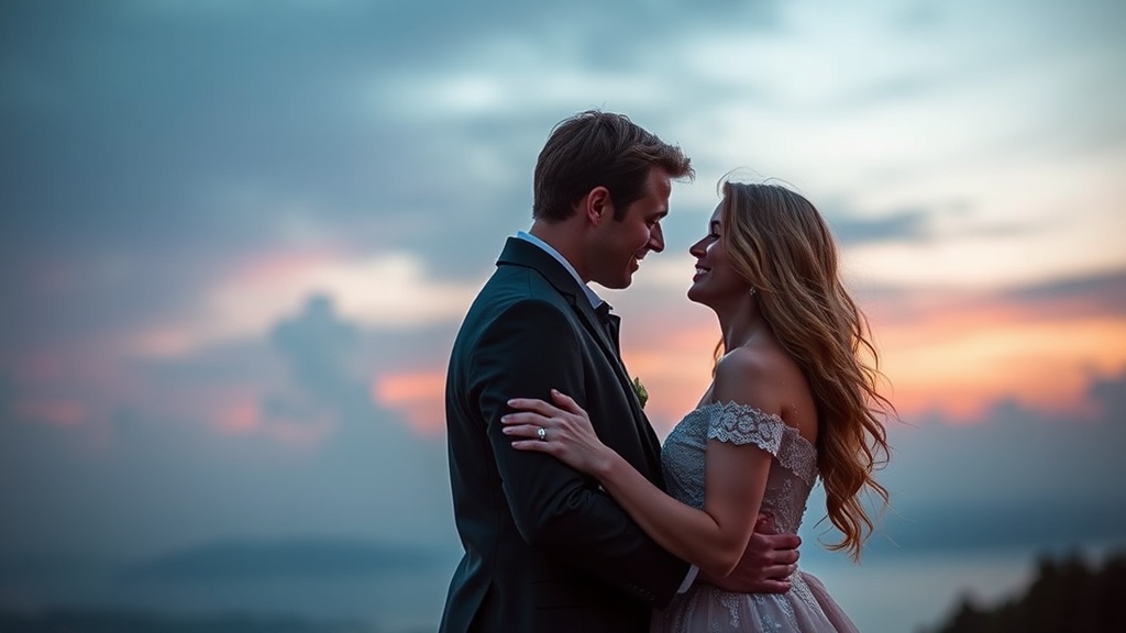
Choosing a Color Palette That Reflects Your Unique Love Story
Many couples assume that choosing a wedding color palette is a matter of picking whatever looks "pretty" on a Pinterest board. That's a mistake. A color palette shouldn't just be a collection of aesthetically pleasing hues; it should act as a visual language that communicates your personality and the specific vibe of your relationship. This post explores how to move past generic trends to find a color scheme that actually feels like you.
Colors trigger emotions. A dusty sage might feel calm and grounded, while a vibrant terracotta screams energy and warmth. If you pick colors based solely on what's trending on Instagram, you might end up with a wedding that looks beautiful but feels completely disconnected from who you are as a couple. We're going to look at how to translate your history, your interests, and even your environment into a cohesive visual identity.
How Do You Choose a Wedding Color Palette?
You choose a wedding color palette by identifying the core emotions of your relationship and translating them into a visual spectrum. Start by looking at your shared environments—maybe you both love the ruggedness of the Laurentians or the sleekness of a downtown Montreal loft. Instead of picking "blue" because it's a safe wedding color, think about the specific shade of navy in your favorite denim or the soft teal of the ocean where you had your first date.
First, look at your home. Your living room or the art on your walls often reveals your natural inclinations. If your home is filled with neutrals and wood tones, a neon pink wedding might feel jarringly out of place. On the flip side, if you live in a colorful, eclectic space, a strictly monochrome wedding might feel a bit sterile.
Next, consider the season and the venue. A summer wedding in a garden setting lends itself to organic, botanical tones, but you can subvert that. You don't have to follow the rules. You could go with a "dark academia" palette—deep emeralds and burgundies—even in July. It's about intentionality.
Here is a quick way to categorize your starting point:
- The Traditionalist: Creams, champagnes, and soft golds. Focus on texture over high-contrast color.
- The Modernist: High contrast, monochromatic schemes, or bold, singular pops of color against black and white.
- The Romantic: Muted pastels, dusty rose, and soft lavender.
- The Adventurer: Earthy tones, ochre, terracotta, and deep forest greens.
Can a Color Palette Affect the Mood of Your Guests?
Yes, color palettes directly influence the psychological state and perceived energy of your guests. Color theory isn't just for interior designers; it's a tool for setting expectations. If you want a high-energy, party-centric reception, you might lean into warmer, more vibrant tones. If you want a sophisticated, intimate dinner, cooler and more muted tones will signal that to your guests before they even arrive.
Think about the lighting. This is a huge one (and people often forget it until the last minute). A palette of deep jewel tones looks stunning under dim, candlelight, but those same colors might look heavy or even "muddy" in a bright, sun-drenched outdoor ceremony. If you're planning an outdoor wedding, check the principles of color theory to understand how light-to-dark ratios affect visibility and mood.
The catch? Don't overcomplicate it. A palette with too many competing colors can become visually exhausting. Stick to a primary color, a secondary color, and one or two accent shades. This keeps the look cohesive rather than chaotic.
For example, if you're working with a tight budget, a limited palette actually helps. It makes it easier to coordinate your floral arrangements and even your bridesmaid dresses without needing a massive amount of custom-dyed fabric. Speaking of budget, if you're worried about the cost of certain hues, you might want to check out our guide on thoughtful spending and wedding budgets.
| Style | Primary Colors | Vibe/Mood |
|---|---|---|
| Minimalist | White, Black, Grey | Clean, Sophisticated, Modern |
| Bohemian | Rust, Ochre, Sage | Warm, Earthy, Relaxed |
| Regal | Navy, Gold, Emerald | Formal, Dramatic, Timeless |
| Whimsical | Blush, Peach, Mint | Soft, Playful, Ethereal |
What Are the Best Ways to Test Your Colors?
The best way to test your colors is to create physical or digital mood boards that include different textures and lighting scenarios. Don't just look at a digital swatch on a screen—screens lie. A digital "sage green" can look wildly different when printed on a linen napkin or seen in a silk ribbon.
I always suggest grabbing actual samples. If you're looking at bridesmaid dresses from a brand like Anthropologie or even standard fabrics from a local craft store, hold them up against different lighting. Hold them in direct sunlight, then in a dimly lit room. Does the color hold its character? Does it feel "right"?
Another way to test is through "The Three-Element Rule." Pick three colors and see how they interact with:
- The Venue: If your venue has red brick walls, a pastel blue palette might look a bit disconnected.
- The Attire: How does the color look against your partner's suit?
- The Season: A heavy burgundy might feel "wintery" even if you're aiming for a summer wedding.
One thing to watch out for is the "Pinterest Trap." You see a beautiful photo of a wedding in a desert setting with terracotta tones, and suddenly you want that. But if your wedding is in a lush, green forest in Quebec, those desert tones might feel forced. Your palette should feel like a natural extension of your environment, even if you're intentionally subverting it.
It’s also worth noting that your color choices can impact your photography. Photographers often love a specific range of colors because they work well with certain lenses and lighting setups. If you're working with a professional, don't be afraid to ask them, "Does this color palette work with your editing style?" They'll appreciate the foresight.
If you find that the stress of these decisions is starting to bleed into your daily life, take a moment. Wedding planning can be a massive drain on your mental energy. Sometimes, a little bit of distance helps. You might find that learning why your relationship needs a digital detox is a great way to reset before diving back into the details.
Ultimately, your wedding is a celebration of a singular moment in time. Your colors should reflect the story you've written together so far. Whether that story is a high-contrast, modern drama or a soft, pastel romance, make sure the palette feels like home.
Steps
- 1
Identify Your Core Aesthetic
- 2
Select a Base Neutral
- 3
Add Accent Colors
- 4
Test the Palette in Different Lighting